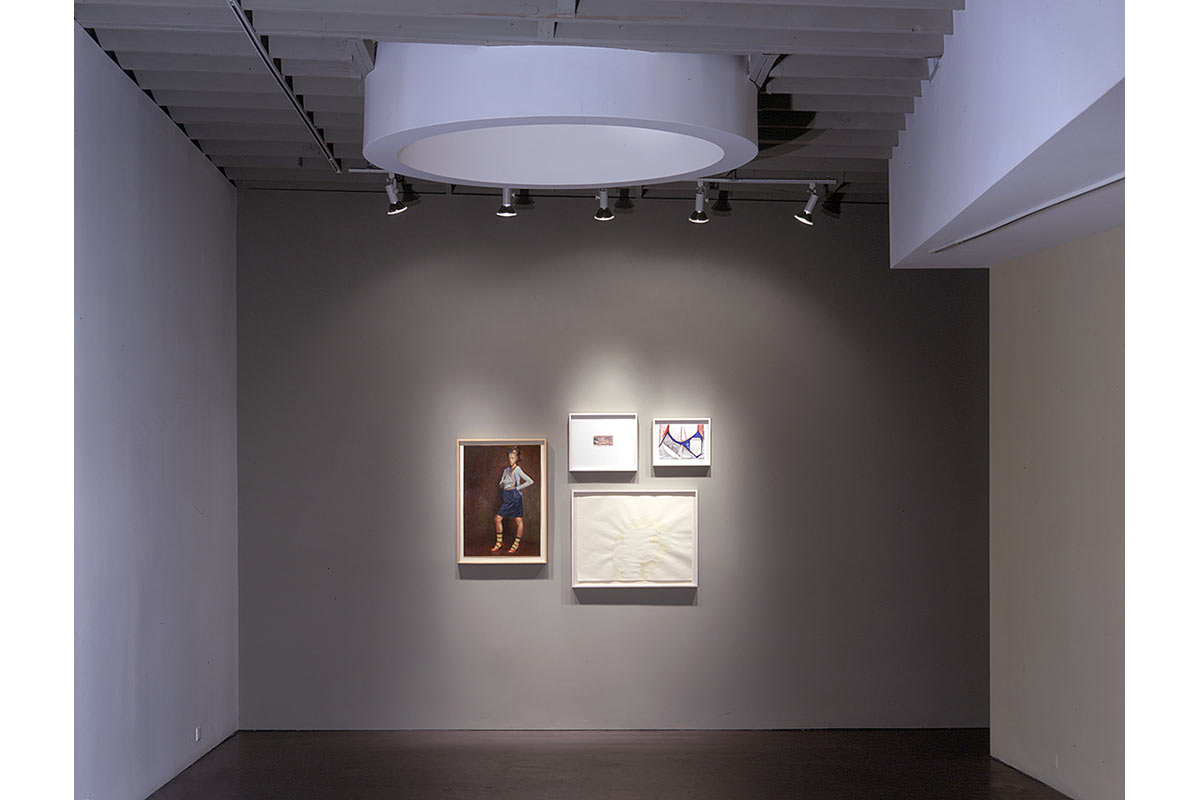
Works on Paper, Inc. is a fine art gallery specializing in contemporary drawings and mixed media work. The client’s program called for breaking the rigid white space art gallery design convention to accommodate art in a wide range of media and format, including small drawings, large scale paintings and photographs, sculpture, and installations. The scale of the space needed an intimate dimension suitable for smaller works and closer in scale to a residential environment.
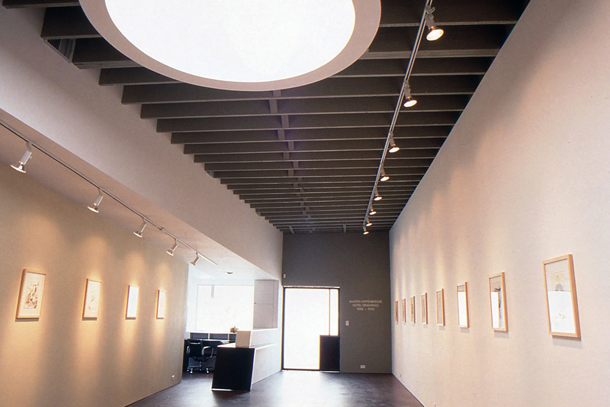
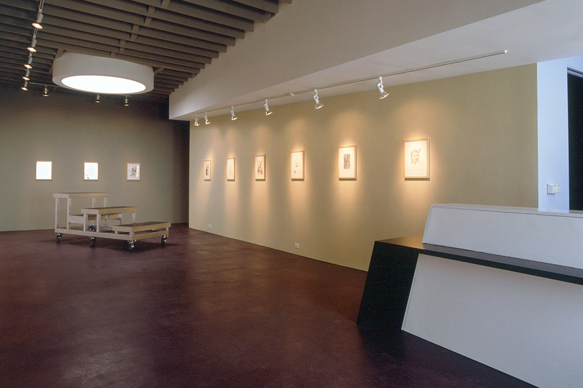
The solution emerged through a concept of flexibility through specificity. A 12-foot high white wall extends the length of the space to accommodate large format work. An angled white soffit was introduced on the west side of the space that alters one’s perspective to create the illusion of expanded space. The wall below this soffit varies in height from 7’-10” to 10’-0” and is painted a yellow beige color. This came to be known as “the intimate wall.” The far wall and the ceiling were painted a medium greenish gray so that these elements would visually recede relative to the white elements and thus perceptually expand the space. A small wall behind the reception desk was painted light blue. And a narrow wall concealed mostly from view leading to the restroom received a dark red as an unexpected “sneaky” accent.
The color palette was a major component of the design. Hue and value were strategically introduced to create the illusion of expanded space and to lend a sense of intimacy while maintaining the abstract nature of the design. This was achieved by assigning a medium warm gray to the ceiling and to the wall plane at the end of the axis of entry, causing the wall to visually recede. The white wall plane and soffit were then left as the primary space-defining forms, with the yellow-beige plane as the secondary one. Light blue and red planes were discreetly introduced on non-display walls as accents. A dark plum-brown ground plane was intended to psychologically “anchor” the space and visually unify the individually-articulated wall planes. Natural light was brought in through a circular skylight placed on-axis with a translucent glass entry door to create a subtle sense of hierarchy and to provide a logical place to locate the occasional sculpture exhibition.
CATEGORY | INFORMATION |
|---|---|
Project Type | Creative Workplace |
Location | Miracle Mile District, Los Angeles, CA |
Status | Completed 1999 |
